
How to Plan a Small Business Homepage That Turns Visitors Into Customers
Your homepage is usually the first page people see, whether they come from Google, a business card or an Instagram bio. In a few seconds they decide whether you can help them. A good small business homepage answers three questions fast: what do you do, is it for me, and what should I do next?
This guide walks through the nine sections that work for most small businesses, in the order visitors look for them, with examples and the mistakes that quietly cost you customers.
Quick answer: put a clear headline and one main button at the top, then what you offer, proof (reviews, photos, logos), how it works, a short about section, answers to common questions, a repeated call to action and easy contact details.
How visitors read a homepage
People don't read websites like books. They scan: the top of the page, the left side and the headings, then whatever catches their eye. Research from the Nielsen Norman Group on how people scan web pages is a good reminder to put the most important words where eyes land first.
On phones, which are most of your visitors, the first screen is even smaller. Whatever matters most must be visible without scrolling.
The 9 sections of a small business homepage
1. A headline that says what you do
Skip slogans like "Excellence in everything we do". Say it plainly: "Fresh custom cakes in Bristol, delivered same day" or "Bookkeeping for freelancers and small agencies". Add a short line underneath with your main benefit.
2. One main call to action
Choose the one action you most want: order, book, call, get a quote. Make it a clear button near the headline. A second, softer option ("See our menu") is fine. Five competing buttons isn't.
3. What you offer
Show your main products or services as three to six simple cards, each with a short description and a link to its own page. Use your customers' words, not industry jargon.
4. Proof that you're trustworthy
This is where visitors decide whether to believe you:
- Reviews with names (and photos if possible)
- Your Google rating. If you haven't set up your profile, see Google Business Profile vs a website
- Client logos, awards, certifications or "as featured in"
- Real photos of your work, team or premises, not stock images
5. How it works
Three short steps take the fear out of buying: "1. Choose your cake. 2. Pick a delivery time. 3. Enjoy." It answers "what happens next?" before anyone has to ask.
6. A short "about" section
Two or three sentences and a real photo. People buy from people, especially from small businesses. Link to a fuller About page for those who want more.
7. Answers to common questions
Add three to five quick FAQs: prices or price ranges, delivery areas, turnaround times, payment options. Every question you answer here is one fewer enquiry, and one fewer visitor who leaves unsure.
8. Repeat the call to action
By the bottom of the page, visitors who scrolled are interested. Give them the same main button again, with a short reason to act now.
9. Easy contact details
Phone number, email, opening hours, address with a map (if customers visit you) and links to your social profiles. On mobile, make the phone number tap-to-call.
A simple homepage wireframe you can copy
Before anyone designs anything, sketch the page as plain boxes. Here's a layout that works for most service businesses and small shops:
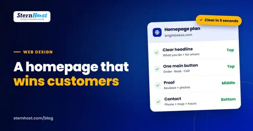
| Position | Section | Example (a bakery) |
|---|---|---|
| First screen | Headline, one line of benefit, main button, one strong photo | "Fresh custom cakes in Bristol, delivered same day" · Order a cake |
| Next | 3–6 product or service cards | Birthday cakes · Wedding cakes · Cupcakes |
| Middle | Reviews and Google rating, real photos | "Best cake we've ever had", Sarah, 5 stars |
| Middle | How it works in 3 steps | Choose · Pick a time · Enjoy |
| Lower | Short about section with a photo of you | "Anna has baked in Bristol since 2015…" |
| Lower | 3–5 FAQs | Delivery areas, prices from, allergies |
| Bottom | Repeat the main button, then contact details and map | Order a cake · phone · hours |
Sketch yours on paper first, fill in real words, then build it. It's much faster to rearrange boxes on paper than pages in a website builder, and it keeps the design focused on what customers need rather than decoration. If you don't have a domain for the site yet, start with our guide on how to choose a domain name.
Homepage mistakes that cost customers
- A big image slider at the top. Most people never see slide two, and it slows the page.
- No prices or price ranges anywhere, so visitors assume you're expensive.
- Walls of text. Short paragraphs and headings are easier to scan.
- Slow loading. Large images and too many plugins push people away before the page appears.
- Hidden contact details. If people can't find your phone number in five seconds, many will call a competitor.
- No clear next step. Every homepage needs one obvious action.
Homepage or landing page?
Your homepage serves everyone: new visitors, returning customers and people comparing options. For ads and campaigns focused on one offer, a dedicated landing page usually performs better. We explain the difference in landing page vs website.
Frequently asked questions
What should be on a small business homepage?
A clear headline, one main call to action, your products or services, proof such as reviews, how it works, a short about section, common questions, a repeated call to action and contact details.
How long should a homepage be?
Long enough to answer the main questions, usually five to nine short sections. Visitors who are ready can act from the top; those who need convincing can scroll for more.
Should prices be on the homepage?
If you can, show prices or "from" prices. If every job is custom, give a typical range or explain how quotes work. Unexplained pricing makes people assume the worst.
How often should I update my homepage?
Review it every few months: refresh reviews and photos, check offers and opening hours, and make sure the main button still matches what you most want visitors to do.
Get a homepage built to bring in customers
If you'd rather not plan and build it yourself, our team can. SternHost web design creates fast, mobile-friendly websites with a homepage structured around what your customers need to see, set up on reliable hosting with free SSL, and your domain in your own name.
See Web Design packages and give your next visitor a clear reason to become a customer.